Project #9 Data Portrait
Looking Out vs. Going Out in Times of COVID
Work in progress...
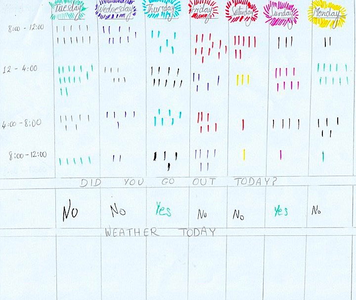
How many times do I look out the window in a week? Why? What was I doing? Most of the time I would be sitting on my desk facing the screen, which I have positioned infront of the window in my living room I would look out of the window when the weather is nice outside and I can't go out because I have a lot of work to do for my masters program. I compared the number of times I looked out in relation to if I had left the house that day or not.
Design Process
Tracking Sketch
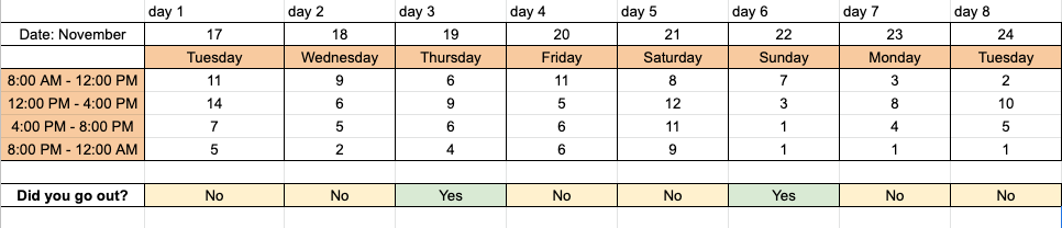
Data Planning Table
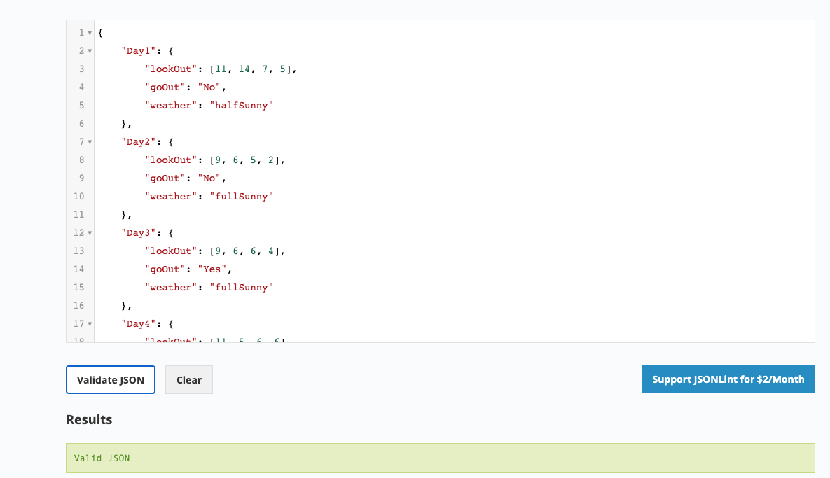
Data Traslantion into JSON
Reflection
What I learnt about myself through the process of self-tracking
I came to the realization that I would look more outside when I haven't gone out during a given day. After tracking my data I became more aware of the need of going out and enjoying a sunny day and to try to make time whenever possible. The process of tracking was rigourous as I had to compile sets of data during four hours and instantly on a sheet of paper. Data visualization plays an important role in experessing, exploring, and reflecting on results. It is also a weapon where we can show a certain lack or addition. I am inspired by a data visualizer called Mona Chalabi as she's been doing amazing work in the field on various topics from an intersectional feminist point of view. "After doing this project and studying Feminist Data concepts, especially principle #7. "Show Your Work" which stresses to Make Labor Visible. The work of data science, like all work in the world, is the work of many hands. Data feminism makes this labor visible so that it can be recognized and valued. An interesting aspect I learned about is when releasing a data product to the public, we tend not to credit the many hands who perform this work. We often cite the source of the dataset, and the names of the people who designed and implemented the code and graphic elements. But we rarely dig deeper to discover who created the data in first place, who collected the data and processed them for use, and who else might have labored to make creations like. To put it more simply, it’s not a coincidence that much of the work that goes into designing a data product—visualization, algorithm, model, app—remains invisible and uncredited. In our capitalist society, we tend to value work that we can see. This is the result of a system in which the cultural worth of any particular form of work is directly connected to the price we pay for it; because a service costs money, we recognize its larger value. But more often than not, the reverse also holds true: we fail to recognize the larger value of the services we get for free. Another key takeaway is that the term invisible labor has come to encompass the various forms of labor, unwaged, underwaged, and even waged, that are rendered invisible because they take place inside of the home, because they take place out of sight, or because they lack physical form altogether.
What was gained / lost through the process of data visualization?
....